 Aaron Beaudoin
UX case study · B2B · In progress
Rinkside for rinks
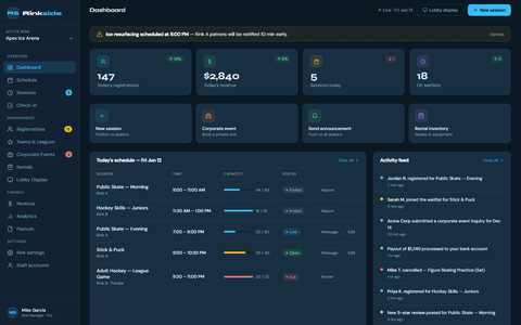
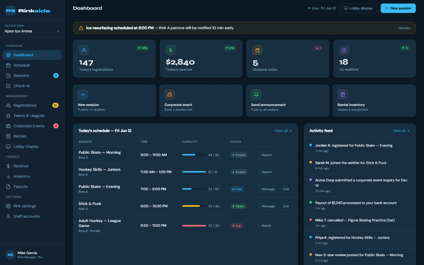
The rink side of Rinkside: enter a session once, and it shows up everywhere it needs to.
The problem
The skater app only works if the schedule is right. Today, rink staff keep the same schedule in two places by hand, re-key game results at the end of the night, and check people in on paper.
Problem statement
A rink manager needs to enter a session once and have it appear everywhere, because today the same schedule is kept in two places by hand.
What I've heard so far
- The schedule gets typed into every system separately (2 of 3 rinks).
- Game results are re-keyed at the end of the night (3 of 3).
- Check-in and waivers are on paper at the front desk (3 of 3).
- Rinks can't see how full their sessions run (3 of 3).
- Every rink has its own rules for waivers, memberships, goalies, and cancellations, so rules have to be settings, not hard-coded (3 of 3).
Research so far
I interviewed three rink staff in person: a front desk employee, a front desk manager, and a rink manager at a university rink. I also audited 11 operator systems from their public pages and reviews.
"I only need to enter it once, and it updates everywhere it needs to."
Operator 1, front desk"I would love to only use 1 system instead of 2."
Operator 2, front desk manager
What surprised me
- Staff describe chores, not features. Re-keying results at night is the one thing all three do.
- Nobody reported a schedule-accuracy problem. None of them tell customers to call and confirm. On the skater side, that was a big complaint, so the pitch to rinks has to be about saving staff time, not fixing accuracy.
Where I am now
Done: the problem definition, an as-is journey map of a rink's week, 85 user stories ranked by priority, 15 success criteria, and 14 concepts scored.
Next: a second round of interviews at three more rinks, then Crazy 8s and lo-fi wireframes.